This is the eighth article in a series on common usability and graphical user interface related terms [part I | part II | part III | part IV | part V | part VI | part VII]. On the internet, and especially in forum discussions like we all have here on OSNews, it is almost certain that in any given discussion, someone will most likely bring up usability and GUI related terms – things like spatial memory, widgets, consistency, Fitts’ Law, and more. The aim of this series is to explain these terms, learn something about their origins, and finally rate their importance in the field of usability and (graphical) user interface design. In part VIII, we focus on the tab.
The tab is a user interface element that has existed for a long time, but only gained a strong foothold during recent years. The tab was first introduced by IBM’s Common User Access, a set of interface guidelines which heavily influenced the early development of Windows. The goal of the CUA was to standardise the myriad of different key combinations and looks among different applications on mostly the MS-DOS platform. For instance, the default order of menus in menu bars (File, Edit) comes from the CUA, as well as various shortcut keys such as F10 to activate the menubar. Windows still uses the shortcut keys as specified by the CUA.
So, what is a tab, exactly? We all know them, but how would you define it? I could come up with my own definition, but seeing Wikipedia already has a good and clear one, that seems a bit redundant:
In graphical user interfaces, a tab is a navigational widget for switching between sets of controls or documents. It is traditionally designed as a text label within a rectangular box with its top borders rounded. Activating a tab (usually by a mouse click) makes its associated content visible and the tab itself usually becomes highlighted to distinguish it from other inactive tabs. Only one tab can be active at a time.
Tabs gained popularity quickly as a method to organise crowded settings panels, a place where you can still find tabs today. If you for instance open the mouse preferences panel in Windows, you’ll see the various options grouped under a number of tabs. While using tabs can certainly improve settings panels, it can sometimes turn into a case of the cure being worse than the disease; two rows of tabs almost always act very confusingly, with the rows sliding up and down. This can be quite frustrating.
Having a single window with multiple documents open under tabs is a tabbed document interface. Most people will be familiar with TDIs in their web browsers, which is indeed one of the most common uses for tabs. The first product to use a TDI was the NeWS version of the Gosling Emacs text editor, and Don Hopkins later developed several add-ons for the NeWS windowing system which allowed every application to use tabbed window frames.
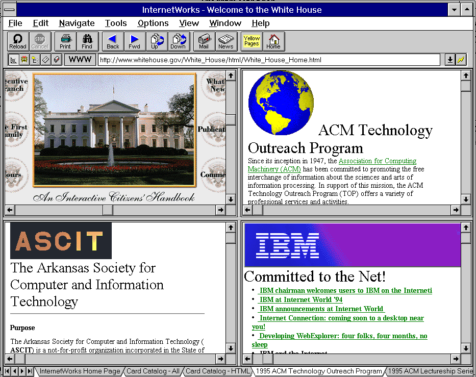
The first hypertext browser (so not web browser) to use tabs was Ben Schneiderman’s HyperTIES browser. The first web browser to sport tabs, however, was InternetWorks. Released in 1994, it sported multithreading (loading and viewing webpages at the same time), multi-pane windows, and tabs (the tabs are located at the bottom). Some, however, disagree with the notion that InternetWorks’s implementation of tabs was actually a form of “tabbed browsing”:
In [InternetWorks] (and I have several copies floating around), tabs represented the navigation stack of a user’s browsing session. To go back or forward, you switched to the different tabs which represented other locations in your session history. Tabs were not in any way independent, you could not right-click “open in new window/tab”. In all modern tabbed browsers, each tab can be independent of the others. You can have one tab open at CNN, one at Slashdot, one at Del.icio.us. [InternetWorks]’s tabs just gave a picture of your navigation stack, that’s all, like an expanded menu in your back and forward button.
The first of the modern web browsers to receive tabbing functionality is – in a sense – Internet Explorer. In 1997, NetCaptor, an Internet Explorer shell, saw its first release, and gained tabs shortly thereafter. NetCaptor’s implementation served as the blueprints for all other modern browsers, with most browsers following suit after NetCaptor. Amiga’s IBrowse implemented tabbed browsing in 1999, Mozilla somewhere in 2000/2001 (through an extension in 2000, and built-in as of Mozilla 0.9.5 in 2001), and Apple’s Safari in 2003. Opera is a bit difficult to classify in this timeline, since Opera had a multiple document interface long before it had tabs – however, MDI is not the same as having tabs. ‘Proper’ modern tabbing wasn’t added as a feature to Opera until 2002, with Opera 7.0.
From there on out, tabs spread like a wildfire through graphical user interfaces, making their way to every type of application, from text editors to instant messaging clients to mail clients to music players. Having tabs became almost a pre-requisite for success.
Advantages and disadvantages
One of the main advantages of using tabs instead of multiple separate windows is that it reduces clutter. All documents are logically grouped inside the main window, leaving more room in the taskbar for other entries. Most tabbed applications also allow you to group related documents together in various different parent windows, which can aid in window management.
This all comes at a price, however. While tabbed interfaces seemingly reduce clutter, they also add another layer of complexity. Most graphical user environments have a single place to switch between windows/applications (the taskbar), and while tabbed interfaces do reduce the number of entries in the taskbar, it does not in fact eliminate them – it only moves them to another location. So, instead of having one place where the user can go to to switch between documents and applications, he now has multiple locations. Switching from document Abc in a word processor to webpage Xyz in a browser may now require more clicks and attention focus switches than in a non-tabbed interface.
More often than not, other window management features (other than the taskbar) do not respect tabs either. Expos̩ in Mac OS X, or the ubiquitous alt+tab command both do not respect tabs, and will cycle through application windows alone, not through tabs. In other words, you need alt+tab to switch to the tabbed application, and then another, application-specific keyboard combination to switch to the proper tab. Again Рadded complexity.
Another disadvantage of using tabs instead of separate windows is that tabs are inherently maximised within their parent windows; in other words, you cannot look at two or more tabs at the same time. This problem was later on solved by making tabs ‘detachable’. While this alleviates the situation somewhat, it still means you have to perform an extra task (detach the tab) – added complexity. Starting to notice a pattern?
Consistency is usually another victim of the tabbed interface. Even though a graphical toolkit might provide a default tab element, few applications use them, instead preferring their own, homegrown tab. A tab in Firefox looks different from a tab in Opera, which looks different from a tab in Notepad++, which looks different from a tab in a Windows settings panel, and so on, and so forth. Yet more complexity.
A final point of difficulty has to do with closing a tab versus closing a window. The tabbed document interface is actually a bastardised (and less capable) multiple document interface, and therefore shares a problem with the MDI: how do you prevent users from accidentally closing the parent window, instead of just the child window (MDI) or tab (tabbed interface)? Tabbed interfaces and MDIs come with multiple close buttons; one for the parent window, and one for each child window or tab. This is yet another example of the tabbed interface actually adding complexity.
Complexity ain’t all bad
The fun thing is though – no matter how many theoretical downsides and disadvantages you can come up with when it comes to tabs, out in the real world, tabs have been a smashing success. Whether you are dealing with an advanced user, or the hypothetical grandmother, few will have problems understanding the concept of tabs, and how to properly use them.
A common sentiment, especially among the Apple and GNOME camps, is that reducing complexity in the graphical user interface is by definition always better than increasing complexity. While this might be true in a lot of cases, the resounding success of the tabbed document interface clearly shows that as with everything in computing, there is no golden rule. The tabbed interface increases complexity, yet it makes working with computers a lot easier for many people.
Sometimes, logic simply doesn’t prevail.
The implementation in Opera was functionally-identical to tabbed-browsing, though. I generally think of tabbed interfaces as an evolution/refinement of MDI, especially since many of the holdout MDI apps provide a row of buttons to select the active document (as did Opera – tabs by any other name).
That is correct but not all tabbed interfaces are MDI. Tabs can be used to represent multiple user elements. These elements can either be forms or just plain controls stacked on top of each other and just BringToFront() the control. If they are child forms in an MDI, when a tab is clicked you just activate/show that form and if they are multiple controls in an SDI form, you just bring the control referenced by the tab index to the front. As far as the user is concerned, he can’t see any difference except that he won’t be able to have multiple views when going with the SDI version because there won’t be any child forms to unmaximize. Having an SDI tabbed interface is much more efficient than with MDI. It faster and slicker. FF is a perfect example of a tabbed interface implemented using SDI. It requires less memory too when compared with an MDI version of it but coding it is a bit trickier so you have to know what you are doing. This is especially important when handling events.
Edited 2008-08-17 01:24 UTC
Now that I think there is a third way too. You can use a real control with page/sheets with tabs and put the controls in there and half of the work will be done for you so no need to worry about activating/showing controls When you think of it, there are many ways.
IMO that point illustrates that neither UI convention is going to be ideal for every situation (rather than indicating a deficiency of tabbed interfaces).
Taskbars, in my experience, have a “threshold of usefulness” – it doesn’t take long (for me, at least) reach the point where it takes a prohibitively long time to find & select a particular window or application using a global taskbar. E.g., I have over 50 tabs open in Firefox at the moment – it would be nightmarish to try manage those as separate windows via the taskbar (or something like Expose).
(Emphasis: mine)
That can be a benefit in many instances – it makes sense if you think of it within the context of operating globally vs operating locally. For my own usage patterns at least, I find it fairly helpful to have a global app-switching mechanism that lets you select individual apps, then a local/app-specific mechanism that lets you select documents within those apps.
It should also be kept in mind that tabbed interfaces are usually optional. E.g., I know people who have been using Firefox for 2 or 3 years but have never used tabbed-browsing (if they even know it’s available). IMO, tabbed interfaces are one of those rare features that can provide real benefit to more advanced users (and/or those of us seriously afflicted with Nerd Attention Deficit Disorder), without burdening more casual users with extra complexity.
There is a fairly simple, logical explanation: people are willing to put up with a bit of extra complexity if there’s a significant added benefit.
Edited 2008-08-16 19:12 UTC
An additional fact worth mentioning is that different applications tend to handle tabbing control differently (different locations, different behaviour to mouse clicks and different key bindings). While you are usually familiar with how your favourite window manager changes content globally, you mostly need to have a look at which application is running at the moment and how to change its content through tabbing.
Oh yes? 🙂
By and large I’ve found that the keyboard shortcuts are usually consistent, at least. On my Windows box, I currently have 4 apps open that use either a tabbed UI or MDI with an internal taskbar (Firefox, MySQL-Front, EditPlus, and “Microsoft SQL Management Studio Express”). In all of them, Ctrl-Tab (or Ctrl-Shift-Tab) works for switching between document windows.
Ideally, I would prefer SDI in combination with floating palette that lists the child windows & lets you switch between them. But I’ve never seen that outside of some old NeXT apps and an old BeOS tool called “Active App”.
Ya rly. Srsly.
Because I’m not using any “Windows”, I can’t confirm this. Regarding different applications that use tabbing on UNIX, Ctrl+Tab (performing the same kind of operation locally that Alt+Tab does globally) behaved differently in Opera (brings up tab selector) and Firefox (switches tabs) and GNotepad+ (does nothing).
It’s not that I am a consistency guy – in fact, it doesn’t matter to me at all because I’m using applications through all imaginable toolkits -, but that’s something I just noticed. Of course, keyboard behaviour isn’t important when you’re only using the mouse.
Furthermore, the corresponding menu items are often missing. While windowing applications had something like a menu “windows” containing “next” and “previous”, associated with shortcut key combinations (I remember Ctrl+PF6 / Ctrl+Shift+PF6 being such shortcuts), today’s tabbed applications don’t seem to have such “next tab” and “previous tab” menu items inside a “view” or “tabs” menu or submenu.
I do see this in Windowmaker all the time. 🙂
[…]
There certainly are poor implementations of tabbed interfaces – but that’s true for any UI functionality / mechanism that I could name.
I do see this in Windowmaker all the time. 🙂 [/q]
That would make sense, given that Windowmaker is virtually a clone of the NeXT UI.
Is there a system/GUI-wide tool in WindowMaker for listing an app’s child windows? It’s been a few years since I used it, but from what I remember most of the “document selector” applets were app-specific (in contrast, one of the things I like about ActiveApp is that it changes to reflect the currently-active app – hence the name).
its also possible in windows managers like fluxbox to group different windows in a tab simply by middle clicking a window bar and drop it on another open window bar
for example, open office doesnt support tabs so if i want to have 2 opened documents, i will have to have 2 instances of open office and 2 entries in the taskbar ..to join them together in fluxbox, all that is required is just dragging one window ontop of another and they will be joined as tabs and they will have different colors to show which one has focus ..
it would have been nice to have this feature in “main stream” window manages
ps:
last time i checked, open office has an old and unmaintained plugin that adds the ability to open multiple documents in tabs
If I remember correctly, the “old” StarOffice I did use in versions 3, 4 and 5 had implemented a kind of tabbed document handling, much as the “task bar” from fvwm95. OpenOffice abandoned this concept in favour of multiple windows. I think this is due to the fact that StarOffice included an own kind of window manager…
I believe that tabs are easier to work with because they present a progression to tiling window managers, which are generally easier to work with than the windowed window managers.
If you look at for example editor in Eclipse, it’s easy to manage tabs here, easy to put up two or three different tabs at once, to split them in different groups and so on. Similar things can be done with options in Blender (these two programs are my favorite examples why tiling window managers are superior to windowed ones).
Give me a break. The entire NeXT UI Paradigm broke ground across the entire playing field.
What’s the point of doing a series if you don’t even cover an indepth look at NeXT UI, BeOS and OS/2?
Ah, a “you-haven’t-covered-my-pet-project-and-now-I’m-gonna-cry” post.
I’d love to cover NeXT, so if you can supply with me with a NeXT machine to do so, I’d be happy to see what I can do for you. In fact, I already covered a bit of NEXTSTEP in the article on the dock.
Thom, I can supply you with NEXTSTEP 3.3 or OPENSTEP 4.2 and they run in vmware and parallels on Macs quite well
I’d supply you with a desktop running OPENSTEP, But I doubt you’d want to pay shipping charges
/me is the resident NeXT nut
Edited 2008-08-18 15:40 UTC
http://www.nextcomputers.org/forums/
I can always supply the ISOs or you can reference them off of the forum linked and run them in VMWare.
Tabs have become so popular that they are even used in programs where they are not really very useful.
Take the X terminal applications. Gnome-terminal and Konsole have tabs for different instances of your shell. But when I have multiple instances of my shell on the same desktop, I’m using them in conjunction with eachother – for instance, browing a man page for a command in one, and typing the command in another one. In this case, I have to keep switching tabs all the time.
Or I might be testing a GUI program in one, and reading its’ log file in the other.
It’s worse with Gedit, as multiple text documents open in new tabs rather than new windows. If I’m editing a frontend and a backend simultaneously, I have to switch between them in order to see what I’ve got written in the other one. It’s annoying because I have to break concentration in order to perform that task.
This whole series has been okay, but one man’s usability is another’s annoyance. I don’t see modal dialogs as an inherant evil, I see them as important when a user has entered a mode that can influence the rest of a program or the rest of the operating system. By forcing the user to make their decisions before continuing on with the program, you avoid the possibility of the user expecting their changes to have been applied.
This is a valid point: Where Documents controlled by tabs are used “side by side” and there’s no means to “transform” the tabs into sub-windows (such as Opera does), a “tabs-only mode” may be a worse solution thatn having multiple windows. Your examples of the shell application and the text editor are impressive; I can imagine other kinds of applications where “tabs-only” may make your workflow get slower due to an increased amount of forced tab switching. In such cases, running multiple instances of the same application – the shell application or the text editor – may definitely be the better choice.
I’ve seen “tab abuse” in a german program that manages the work of psychologists. This application is one of the worst designed ones I’ve ever seen, and of course, it’s very expensive. Must be the expensive tabs inside. 🙂 Instead of a useful menu, it uses tabs to group buttons that control the different actions, but the content that is brought up then is presented in sub-windows that do not allow windowing control, just as double-fixed dialog windows. This application really is a usability nightmare and would be a good means to torture Thom as the author of the “Common Usability Terms” series. 🙂
Do you happen to have access to screenshots of this application? If so, be sure to edit out the personal information (probably a redundant warning, but better safe than sorry).
And … opening another instance of the terminal app is hard to do? Just because an application supports tabs doesn’t mean you are forced to use them. Start the app multiple times, with a single tab in each one.
With Konsole 4.1, you can now split the view horizontally or vertically, so you can have any number of shells open and viewable at once.
Edited 2008-08-17 20:32 UTC
Which effectively means Konsole now has an MDI interface.
The problem that I have with the Gnome philosophy is that they confuse simplicity with usability. That is, they assume that if they make a given task a simple as possible that it will automatically become more usable.
This (as demonstrated by the article) is not always the case. Other examples include Gnomes “control” panels (i.e. Networking, XGL) which provide no options for advanced users, presumably because adding these options might confuse novice users.
This way of thinking makes for frustrating software, as you are reduced to finding non-intuitive ways of performing otherwise simple tasks.
BTW. Big fan of these articles. Keep them coming.
This discussion has made some good points about when tabs can aid usability and when they can hinder it.
when used within top level windows
What isn’t really discussed though is tabbed dialogs. This old article pretty much explains why they are almost always bad and why there is usually a much better alternative: http://homepage.mac.com/bradster/iarchitect/tabs.htm
That was an interesting article…particularly the similarity I noticed between the ‘innovative’ MS Office Ribbon and this piece of old software:
http://homepage.mac.com/bradster/iarchitect/images/tabtool.gif
GACGAS
There is a deeper problem behind this whole tab issue:
Whenever a new technique is used to better handle complexity there’s less pressure on developers to reduce complexity.
One example are tabbed interfaces, as opposed to just showing all available options without any kind of nesting. Tabs/nesting are exponentially more powerful than just showing the options – think one digit vs 9 tally marks, two digits vs 99 tally marks, …
The downside is, of course, that people have to grasp how to write a number (say to base 10) instead of just scratching lines.
After a certain number of tasks (depending on the person) the additional effort becomes worth it.
You can already see a primitive version of this in the taskbar itself:
The system tray. It only delays the problem, it doesn’t solve it. At some point you need tabs or virtual desktops or both. Until recently (a couple of weeks ago, just check Thom’s blog) I thought that tabs and multiple desktops were the best things since sliced bread. I looked at Gimp and thought “God damn you guys! Who the hell do you think you are littering my desktop with windows?!?”.
Then it dawned on me:
Tabs popping up in just about any app indicate that the OS/DE does not provide sufficient means to group tasks/windows, switch between them, and view them side by side.
Every OS/DE I’ve used so far (Win 98/XP, KDE 3.5, Gnome 2.something) totally sucked ass at this. Vista and KDE 4 haven’t fixed this yet as far as I know. I don’t really care for eye candy either.
If 60 windows are swirling around me that’s still about 55 too many – no matter how fancy the animation.
So app developers work around the issue and start adding tabs. Or people use virtual desktops. And you don’t notice the problem anymore.
I know I didn’t until recently.
But the point is, these methods don’t work together very well and they don’t scale. Thom already touched upon the friction between tabs and windows (a decent, possibly system wide undo could fix some of it) so let me just explain what I mean by “scaling”:
The problem is that they are basically that taskbar, system tray, virtual desktops, tabs and whatnot are patchwork. There is no obvious way to express cross-cutting concerns like:
“Give me all the windows/tabs that are work related, and are either from (insert pdf reader) or (insert latex editor).”
There is also no elegant way to extend this like:
“Hide all the windows that haven’t been active in 30 minutes.”
or “Hide all of the windows tagged ‘work, project A'”
As you can tell by the last sentence, I believe that some sort of tagging might solve these issues in a more elegant way. Extending it is both obvious and easy if the DE provides enough attributes.
The main problem is to make this easy to use for Joe Average who doesn’t want to think about tagging and queries.
I don’t think Joe Average has 55+ windows open on average.
Thus all this makes me think again whose agenda is being called?
Have you ever wondered why?
This is like watching a dog with three legs and claiming “He’s fine. He doesn’t jump that much anyway.”
If there’s one thing humans are good at it’s coping with (artificial) limitations and working around them. Like app developers using tabs to work around the suckiness in the underlying DE/OS.
The point is that _because_ the taskbar blows chunks at >5 windows (give or take) people are basically emulating a more powerful environment by opening and closing apps repeatedly.
When I only had the taskbar, I’d find myself running about 5 windows at a time. Pushing some apps in the system tray I got to about 10. Using tabbed apps and counting each tab as a window gives me a chance to have about 20 open at a time and still feel comfortable. With virtual desktops this number increases to something between 30 and 60, depending on the situation.
Just about any person I’ve talked to who has used multiple desktops finds going back to a single one painful to say the least. Even OSX Leopard and Gnome, products with a strong focus on simplicity, have virtual desktops.
I find it very hard to believe that about 50 windows ought to be enough for everybody ™, some constant of nature like the speed of light or pi…
Likewise I find it naive to assume that Joe Average who started out with single tasking and now runs several programs at a time will never want to run more – not even if advancements in DEs allow him to.
Edited 2008-08-18 14:06 UTC
If you want to have 55+ windows open be my guest. I never said there should be a hard limit. Though i doubted wether we are seriously addressing the needs and greeds of the average computer user or we are academics f*cking ants for our own purposes.
My point was that the number of windows the average computer user has open will increase as well, he’s just a little behind the curve…
Besides, simple everyday situations can mean a lot of open windows.
Like chatting with a couple of friends, watching a video on youtube, using Google, checking your email, listening to music, editing pictures, …
Of course you can work around this by opening and closing apps repeatedly but it’s just that: a workaround.
I don’t buy the assumption lots of windows == rocket science.
Well, maybe we’ll just have to agree to disagree…
don’t be too sure about that. I have to work with “average joes” that can barely use computers. they seem to think minimizing a window means it is closed. I’ve seen people with brand new machines crawling with all 2gb of ram used up and several gigs of swap because they had, literally, 2-300 windows open for explorer, IE, and various programs.
I get called to come get “rid of the viruses” and all i do is reboot the machine
Edited 2008-08-18 15:46 UTC
And charge them $60 for having “the knowledge” necessary to solve the problem?
you know it
I don’t know if it is completely handled in OSX, but its a damn sight better then any other environment I have used. Spaces + Expose is better then any of the clones I have seen anywhere else.
There were two other Mozilla based browsers that both did tabbed browsing before Mozilla itself: Skipstone (v0.7 1999) and Galeon. Both were GTK-based and helped inspire Mozilla’s implementation.
I could swear that Opera 6 had a ‘proper’ Tab implementation — with the graphic and all. I can’t find the screenshot now, but I was trying to show my friends how awesome tabs were since I loved Opera so much at the time. If you’re disagreeing with me, what about Opera 6’s tab implementation makes it improper?
Since that time, I’ve actually grown to hate tabs for a lot of the reasons you’ve mentioned — alt+tab doesn’t work among other things. Luckily, the Opera Devs have kept “SDI” implementations available through preferences. My Opera opens windows rather than tabs and I have removed the tab bar as it is just a waste of space that could have more OS News content. It gives me Alt+Tab back, which is nice.
On top of that, I’ve changed the way I look at my UI in general — the Windows Taskbar is essentially a tab bar but for all applications, to me. I can easily identify the content of a webpage by looking at its place in the Taskbar. If I get too many open, Windows Groups them together, making it easier for me to read the title attribute of a window. Of course, that’s one more click and one more attention focus than as if everything were just in the taskbar, but it’s become very usable to me. (I would even argue that it’s not necessarily one more attention shift since I just look for the icon representing the applicaiton I want before narrowing it down to a specific instance of that application. Image recognition is simpler than reading the words.)
Edit:// I also meant to mention about “bad” tab implementations. I’m looking at you, IE7. Having the tab bar BELOW the address bar flies in the face of all things sensical and right! Changing a tab should change the content below it, with the tab being the ‘major’ grouping. I just don’t see why it makes sense to have a tab bar in the middle of the things it’s changing.
Edited 2008-08-18 19:55 UTC
Using Opera, I have my tabs vertically on the right side. This is very cool, as you have suddenly much more space for your tabs (and since I always recover the last session and avoid using bookmarks, I often have about 100 opened tabs).
Recent development shows that many other programs use an approach like that, like having a list on the left or right side acting as a replacement for the former tabby stuff.
As you mentioned in your post, if there are too many tabs, most programs will turn that to some confusing multi-column tabs then, but the cool thing in Opera is that they aren’t “ordinary” tabs, in fact they do resemble ordinary buttons (with the active one being highlighted), so there’s no need to shift them all to another column (like in some confusing Windows dialogs).
The worst thing I’ve ever seen related to tabs was in Visual Studio 6.0, there was a very tiny window (VERY tiny!) that had the following tabs:
Allgemein (= General)
Formate (= Formats)
Erweiterte Formate (= Extended Formats)
Weitere Formate (= More Formats)
Weitere Erweiterte Formate (= More Extended Formats)
That showed me how you can really mess up with using tabs. And in that case, they’d just have to make the window a bit bigger
Hehe, just found a screenshot:
http://www.wachtler.de/unsinn/weitere_erweiterte_formate.png
Edited 2008-08-19 15:29 UTC