Rather than some designer’s flashy vision of the future, Windows 98 icons made the operating system feel like a place to get real work done. They had hard edges, soft colors and easy-to-recognize symbols.
It’s obvious that the icons were meticulously crafted. Each 256-color .ico file includes a pixel-perfect 16×16, 32×32 and 48×48 version that looks equally good on the taskbar and desktop.
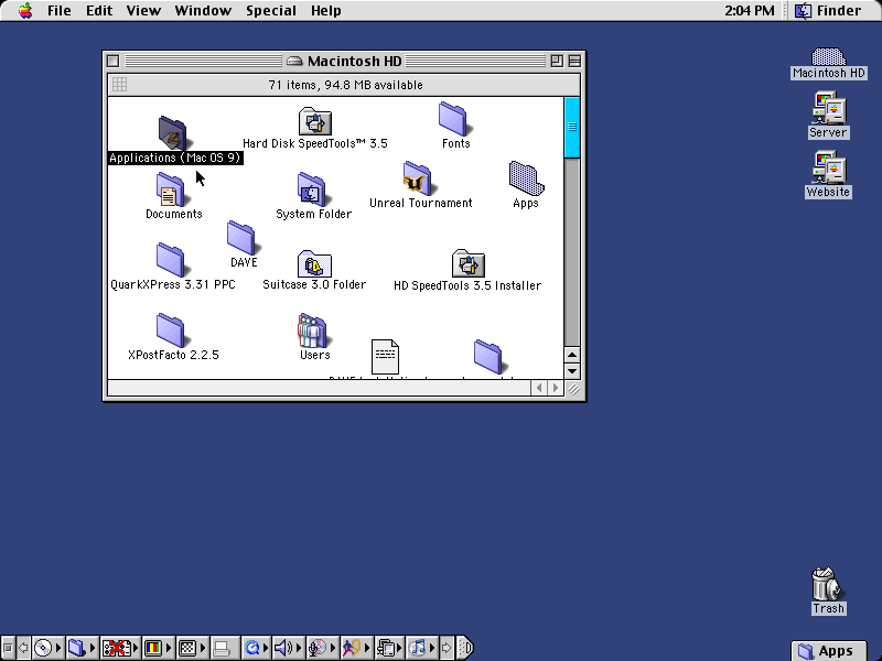
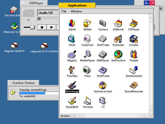
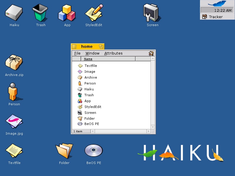
They are, indeed, quite good. Most platforms from that era had exquisite icon design – think Mac OS 9 or BeOS – and we really seem to have lost some of that usability. I feel like Haiku’s current icon set best captures that same aesthetic, but in a modern coat (and a unique, custom-designed vector icon format).
Unfortunately the haiku icons aren’t hinted and don’t contain attentive low resolution vector data so the icons look pretty bad are 16×16 and even sometimes at 32×32 on non-retina.
The funny thing about windows icons is that every iteration after 3.1 had a subset of icons from previous versions of Windows. As good as the windows 98 icons were, they would have been even better had they been consistent platform wide.
I was just thinking that – “but does the Haiku icon format account for small icon sizes?” This is an issue even on high-DPI displays, and is still an unsolved problem for SVG icons that has led to all kinds of “responsive SVG icons” web development hacks. To get an idea of why a simple “one size fits all” vector icon doesn’t work check out e.g. this article: https://www.pushing-pixels.org/2011/11/04/about-those-vector-icons.html
Ultimately i’m not sure hinting is the answer, even though it is probably the most space-efficient way of doing things, since as that article points out it adds a lot of esoteric complexity. It would be enough if Haiku were to support multiple versions for different icon sizes (defined in a pixel-density independent way such as “virtual” pixels or some such).
“Unfortunately the haiku icons aren’t hinted and don’t contain attentive low resolution vector data so the icons look pretty bad are 16×16 and even sometimes at 32×32 on non-retina.”
…on the contrary, isn’t that exactly what the “Level of Detail” feature is in HVIF?
See here: https://www.haiku-os.org/docs/userguide/en/applications/icon-o-matic.html#i-o-m-shape (“Level of Detail”)
“With the LOD you control the visibility of a shape depending on its size. That way, you can leave away details of an icon that look good on a bigger icon, but maybe not so much on its smaller version.”
Win98 is an interesting choice for this type of comment, because it marked the beginning of 256 color icons. With 16 color icons, there was no real possibility of gradient type effects – all objects needed to have sharp lines and flat color. The addition of 256 color icons allowed for more artistic representations, but these end up being more visually complex and slow down recognition. The primary point of an icon is to identify something at a glance, which is very different to art. The more data is stored and conveyed in an icon, the more data the user has to interpret.
The problem with Windows 10 is not the old or the new icons, it is the existence of both.
Small exercise 1:
Press WinKey + i (Settings) and have a look at the new icons. All of them are pretty good, although they look nothing like the icons in Windows 98. Now go further into the settings by clicking Personalization > Themes > Desktop icon settings. You should now see all the icons in imageres.dll. If you scroll from left to right there are lots of great “98 looking” icons…untill you suddenly reach the new ones that are black-and-white. That jump is schocking, but while you are in the new settings everything is looking okay and consistent yet completely foreign compared to the old control panel
Small excercise 2:
Press WinKey + e (Explorer) and have a look at all the icons. Again they are all pretty good by themselves and I really like how “a folder for pictures, a folder for music, etc” are displayed in the main screen compared to their smaller versions on the left-navigation-tree. But compared to the “old” icons from imageres.dll and the new icons from the settings screen these icons seem to come from an inbetween era.
This is my main problem with the looks of Windows 10. There are several different parts of the system and all of them look okay by themselves and completely out-of-place in the grand total
Funnily enough, even within the newly designed Windows 10 iconsets there’s two distinct styles – colourful yet flat icons for the Win32 environment inspired by the historical iconset (look at the flat Control Panel icon for example) – still somewhat skeuomorphic and metaphorical, and the monochrome UWP/Metro icons which are more abstract and directly representative.
Those coloured icons aren’t holdovers – they’re not from Windows 8, and some of them have been inserted in the last couple of updates.
Even within Microsoft, right this second, the designers aren’t all on the same page.
TBH I found the Mac OS 9 icons ugly and inconsistent, even back then. Just look at the two different folder icon perspectives. Windows 98 was a jumble of isomorphic and non-isomorphic perspectives – compare the computer icon to the recycle bin – as a result of the incomplete implementation of updated design in comparison to Windows 95 (which btw was very consistent). BeOS clearly takes the cake for the most beautiful and consistent icon set from that era, and perhaps ever. 😉
>BeOS clearly takes the cake for the most beautiful and consistent >icon set from that era, and perhaps ever.
Bleh. When will people like you ever realize that pretty icons and mouse gestures does not make a viable OS/UI ? Seems like you guys will never learn from things like BeOS itself,Amiga,Atari ST,Windows Vista, Windows 8, Gnome 3, ect,ect,ect……..
,