If you’re of a certain age (and not American), there’s a specific corporate font you’re most likely aware of. You may not know its exact name, and you may not actively remember it, but once you see it, you know exactly what you’re looking at. The font’s called Nokia Sans (and Nokia Serif), and it was used by pretty much every single Nokia device between roughly 2002 and 2013 or so, when it was replaced by a very bland font made by Bruno Maag (with help from the person who designed Comic Sans) that they used after that.
I can’t remember why, exactly, but I got majorly nostalgic for Nokia’s characteristic, recognisable font, and decided to see if it would work as a user interface font. Now, the font is still owned by Nokia and I couldn’t find a proper place to download it, but I eventually stumbled upon a site that had each individual variant listed for download. I downloaded each of them, installed them using KDE’s font installation method, and tried it out as my user interface font.
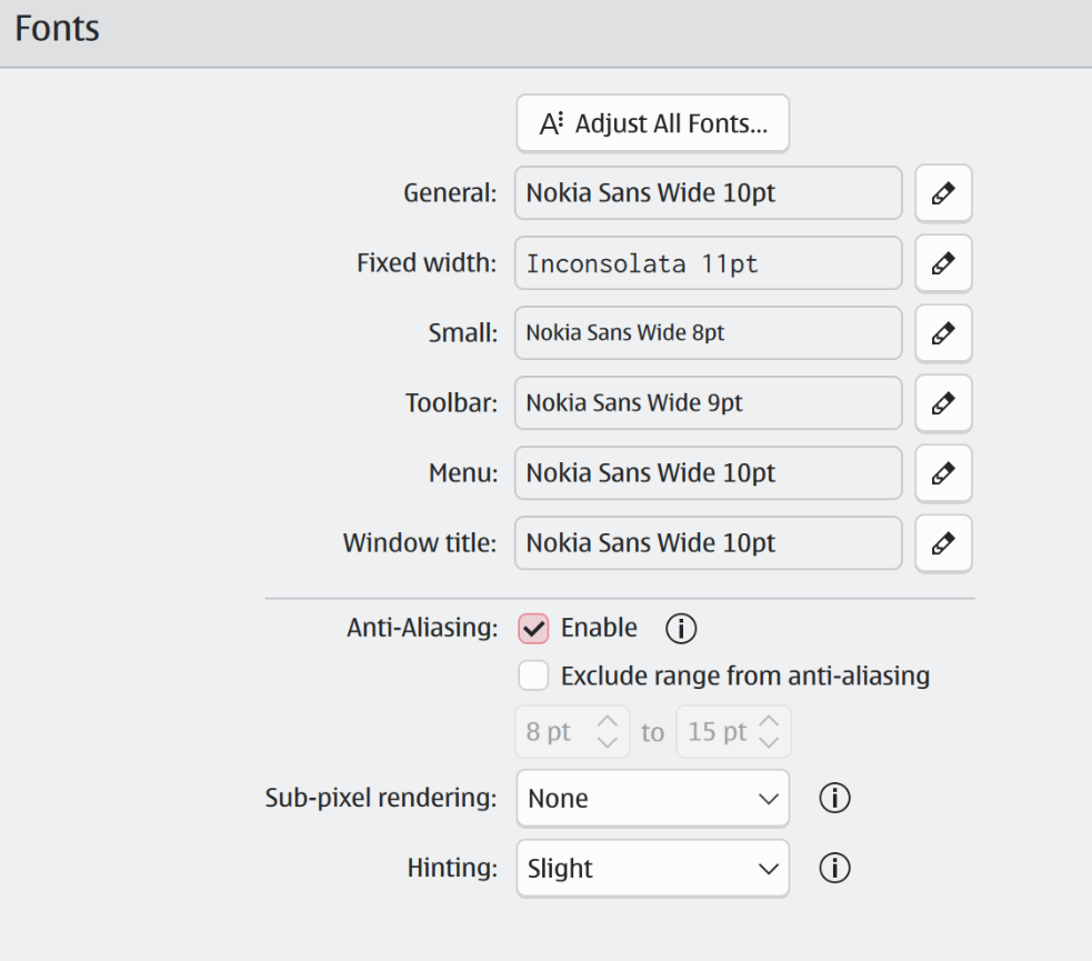
You’ll quickly discover you shouldn’t use the regular variant, but should instead opt for the Nokia Sans Wide variant. Back in 2011, when Nokia originally announced it was replacing Nokia Sans, the creator of the font, Erik Spiekermann, responded to the announcement on his blog. Apparently, one of the major reasons for Nokia to change fonts was that they claimed Nokia Sans wouldn’t work as a user interface font, but Spiekermann obviously disagrees, pointing specifically to the Wide variant. In fact, Spiekermann does not pull any punches.
After 10 years it was high time to look at Nokia’s typefaces as the dominant visual voice of the brand but whoever decided on a completely new direction was either not aware of what was available or was persuaded by Bruno Maag to start over. Bruno may not create the most memorable typefaces, but he certainly knows how to sell them. And technically, their fonts are excellent. Too bad they didn’t have the confidence to work with me on an update. Instead they’re throwing out ten years of brand recognition in favour of blandness.
↫ Erik Spiekermann
I was pleasently surprised by just how nice the font looks when used as a general user interface font. It’s extremely legible at a variety of sizes, and has a ton of character without becoming gimmicky or overbearing. What originally started as mere curiosity has now become my UI font of choice on all my machines, finally displacing Inter after many years of uncontested service. Of course, all of this is deeply personal and 95% an issue of taste, but I wanted to write about it to see if I’m just entirely crazy, or if there’s some method to my madness.
Do note that I’m using high DPI displays, and KDE on Wayland, and that all of this may look different on Windows or macOS, or on displays with lower DPI. One of Inter’s strengths is that it renders great on both high and lower DPI displays, but since I don’t have any lower DPI displays anymore, I can’t test it in such an environment. I’m also not entirely sure about the legal status of downloading fonts like this, but I am fairly sure you’re at least allowed to use non-free fonts for personal, non-commercial use, but please don’t quote me on that. Since downloading each variant of these Nokia fonts is annoying, I’d love to create and upload a zip file containing all of them, but I’m sure that’s illegal.
I’m not a font connoisseur, so I may be committing a huge faux pas here? Not that I care, but reading about font nerds losing their minds over things I never even noticed is always highly entertaining.
It looks great in Xfce on my 1440p display without scaling, so much so that I’m using it as my system wide font now (wide variant as suggested). The instant Nokia N900 nostalgia hit hard and I really wish Nokia was still around making Linux phones today.
Morgan,
I am conflicted about N900 and others in the series. I had the N800 (the Internet “tablet”). They quickly abandoned it for N810 when the new product launched. It survived a bit with (limited) open source support but became essentially useless soon after.
And then I had the N900. They abandoned that line when they switched to Windows.
(And yes, the font brings nostalgia)
What brought Nokia down? Their extremely anti-consumer behavior with their software and firmware support (was not much better in the Symbian land).
Out of all the other Symbian phones, Nokia (albeit some 3rd party ROM downloader, the name of it is slipping my mind) had proper repository to download and flash ROMs. Nokia 5800 Xpress Music was one such legend.
smokeless3618,
That Nokia 5800 XpressMusic looks suspiciously close to later N900 🙂 Anyway, I had several Symbians and the issue was almost always software availability.
The best “experience” was with a Sony-Ericsson one. I could use it as a USB modem, synchronize messages, contacts and calls to my Windows desktop and a lot more (there was some free or open source software).
But ROM hacking? XDA was probably in it. At least back then they were the place to go (for Windows Mobile ROMs, and later Android)
I still have a N900 and a Nokia 5800 Xpress Music. Out all of the phones I have possessed they are the ones I am most fond of.
I may not agree with you on much (and I’m on Mastodon!) but you are spot on here! This is a very nice user interface font. I was also using Inter for a while, it’s great. I’ll have to try this out later.
@Thom:
All you need to do now is disabling anti-aliasing 😉
Sidenote: wtf, one can’t easily install one’s own fonts on android?
Not great, not terrible.
You should see the font for Nokia’s latest logo. Just painful.
I tried it in KDE for a day. I don’t have a high DPI monitor, my resolution is 1920×1200 on an aging Nvidia video card. I didn’t like it, it just feels too wide.
I have no attachment to Nokia phones, as my family’s first cell phone was an LG in 2006, and my first cell phone ran Android 2.x in 2010.
Of course it reminds me of the Nokia devices but also at one of my first Linux I used. Red Hat Linux screenshot here e.g. very similar UI experience in my opinion love the flashback with “blue curve” theme https://uk.pcmag.com/first-looks/29767/red-hat-release-makes-linux-more-approachable
Of course, it’s a decent user interface font because it was designed to be a user interface font. It’s probably not today’s best UI font because it was presumably designed for limitations that don’t exist in modern devices: mostly used in fiddly little menus, limited pixel density, small screens, etc.
I love it as a UI font on my Linux Mint. Works great, very readable.