
The menu bar
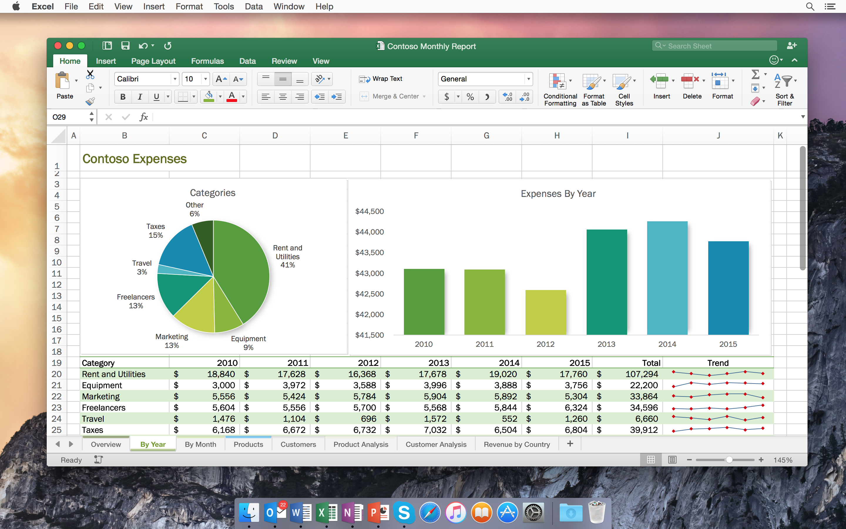
Look at this screenshot of MacPaint from the mid-1980s. Now look at this screenshot of a current version of Microsoft Excel for Mac. Finally, consider just how different the two applications actually are. The former is a 30-year-old black and white first party application for painting while the latter is a current and unabashedly third party application for creating spreadsheets. Yet despite having been created in very different decades for very different purposes by very different companies, these two very different applications still seem a part of the same thread. Anyone with experience in one could easily find some familiarity in the other, and while the creators of the Macintosh set out to build a truly consistent experience, there is only one significant piece of UX that these two mostly disparate applications share - the menu bar.
The lack of a menu bar in (most) touch applications is really what sets them apart from regular, mouse-based applications. It makes it virtually impossible to add more complex functionality without resorting to first-run onboarding experiences (terrible) or undiscoverable gestures (terrible). While menus would work just fine on devices with larger screens such as tablets and touch laptops - I use touch menus on my Surface Pro 4 all the time and they work flawlessly - the real estate they take up is too precious on smartphones.
If touch really wants to become a first-class citizen among the mouse and keyboard, developers need to let go of their fear of menus. Especially for more complex, productivity-oriented touch applications on tablets and touch laptops, menus are a perfectly fine UI element. Without them, touch applications will never catch up to their mouse counterparts.


 Submitted by
  Submitted by
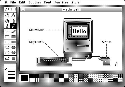